
Introduction
0% Sugar. 100% Madrid.
Sugar is typically a key ingredient in vermouth. However, when Alba shared her vision for this project, I was fascinated—especially by the pioneering nature of the concept and her unwavering commitment to her roots and values.
Year
2020
Duration
5 Weeks
Client
Alba Ortega
Type
Branding | Visual Design


Challenges
Madrid in a Bottle
It was non-negotiable: at first glance, the bottle had to be unmistakably identified as a Madrid vermouth. Across the four product ranges, every bottle needed a direct connection to the city, featuring a distinctive element that left absolutely no room for doubt.


Solution
The Madrid 3x3 Grid
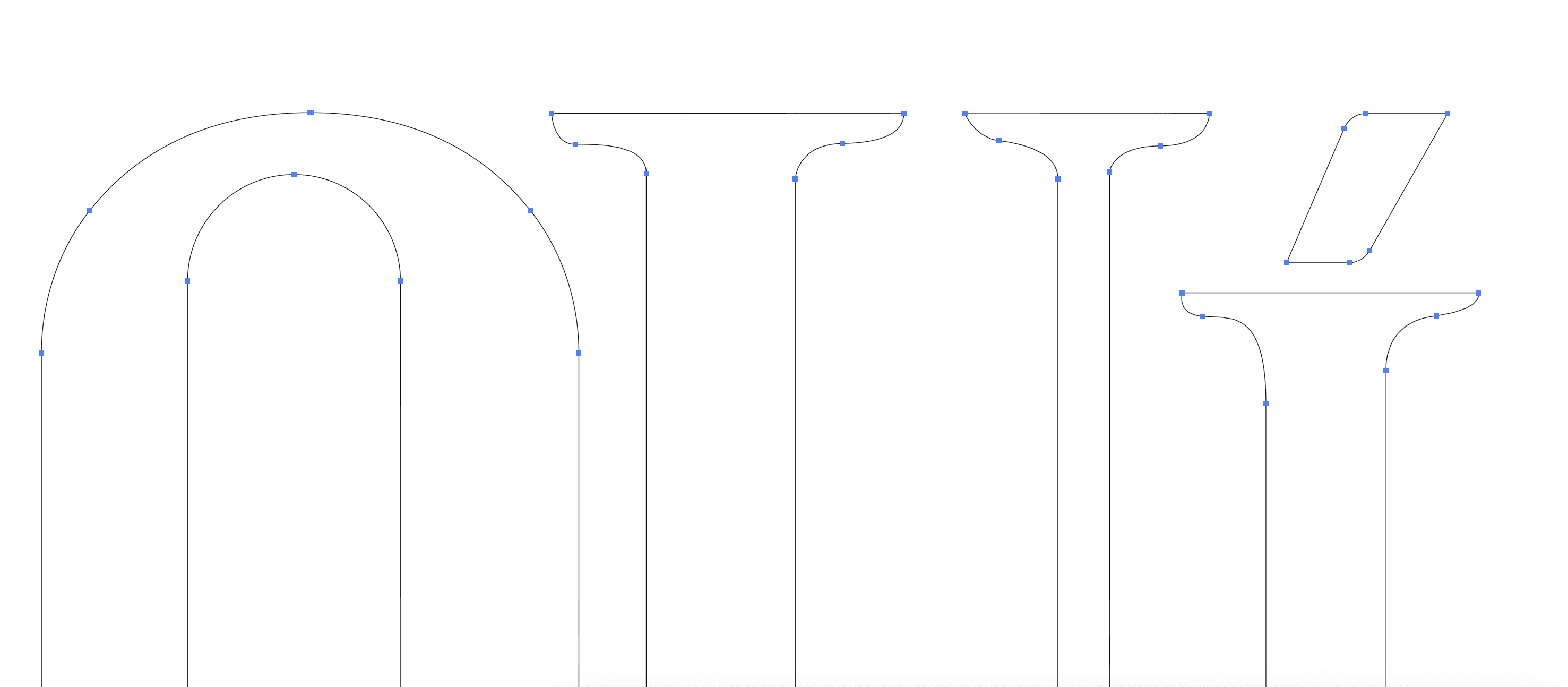
I decided to adopt the iconic 3x3 ceramic tile structure that marks the street names in central Madrid, paired with carnations and an ad hoc typeface constructed specifically from the original tile lettering inspired on the handwritten original. The color palette was extracted directly from the streets themselves. The result is a bottle that, even from a distance, screams Madrid.
For the photography Art Direction, we rejected the idea of idyllic, pristine studio shots. We wanted the bottles in their natural habitat, doing exactly what they do best: being unapologetically castizo.

View More.
One story down. Many more to discover.

